

Picture the serenity of an early morning mist, hovering over the lush landscapes of South Africa. Now imagine capturing that tranquillity in your living space. That’s exactly what Plascon Paint Expert aims to achieve with our Drift of Mist Colour Palette. This collection is not just paint; it’s an invitation to bring the essence of nature’s calm right into your home. From the refreshing touch of Frozen Limeade to the profound depths of Bottlenose Dolphin, each colour tells a story. Let’s embark on a colourful journey to explore how these shades can redefine your interiors.

Misty Hues
1. Frozen Limeade (Y7-A2-3)
A warm off-white with a whisper of yellow, as subtle as the first light of dawn.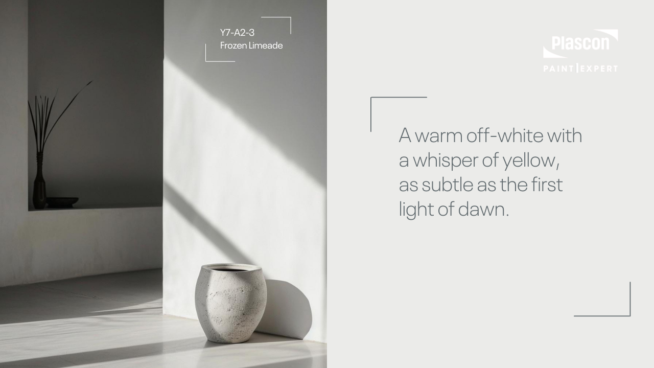
2. French Chartreuse (Y5-D2-3)
A versatile earthy tone that shifts its personality based on its surroundings. It’s the chameleon of the palette, enhancing and transforming with a quiet grace.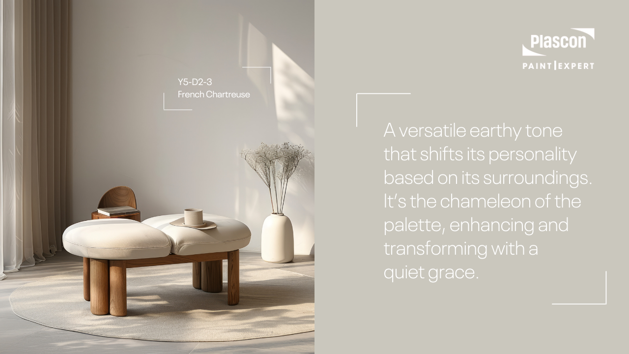
3. Maison Blanche (Y1-E2-1)
Warm and earthy, this shade carries hints of brown and yellow, reminiscent of a secluded cabin wrapped in the comfort of an old forest.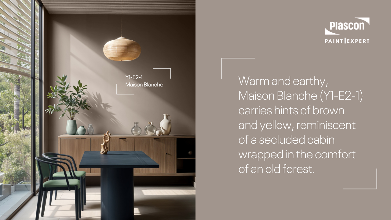
4. Bottlenose Dolphin (B3-E1-4)
A deep, contemplative blue-grey that echoes the majestic presence of its namesake gliding through the ocean depths.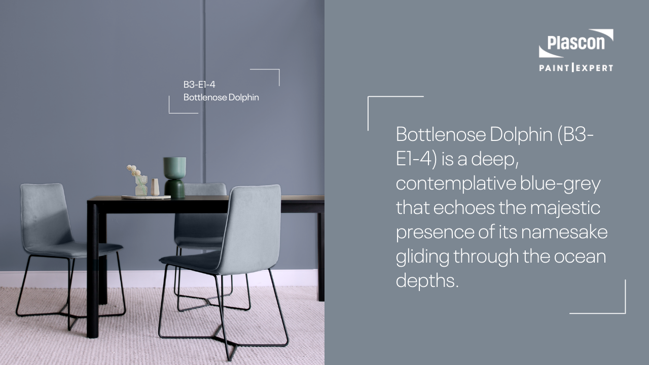
5. Fynbos Leaf (57)
A herbaceous grey with green undertones, evoking the rugged beauty of South African mountain flora.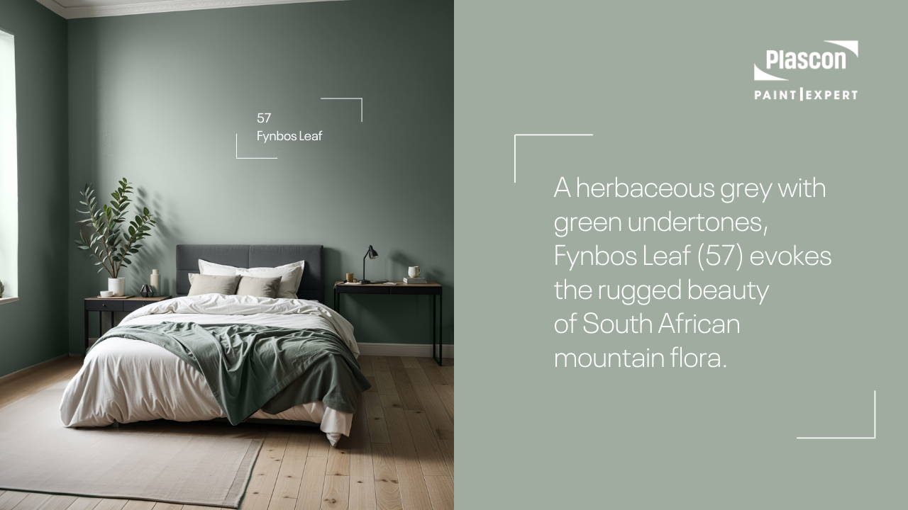
6. Gravel Road (B5-E1-3)
A deep, cool grey with blue undertones, like the rocky paths that wind through foggy hills at dawn.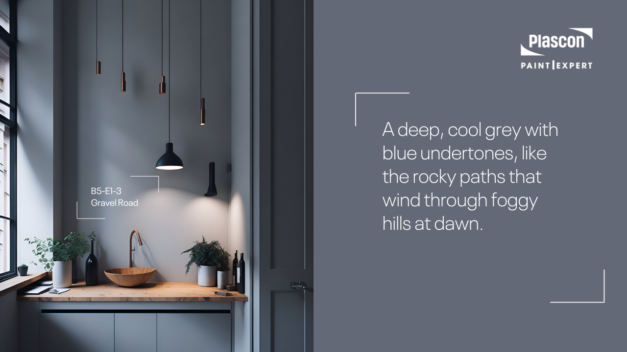
7. Aqueous (G4-E2-3)
A soft, sage green that subtly brings the outdoors inside, pairing beautifully with warm neutrals to create a restful ambiance.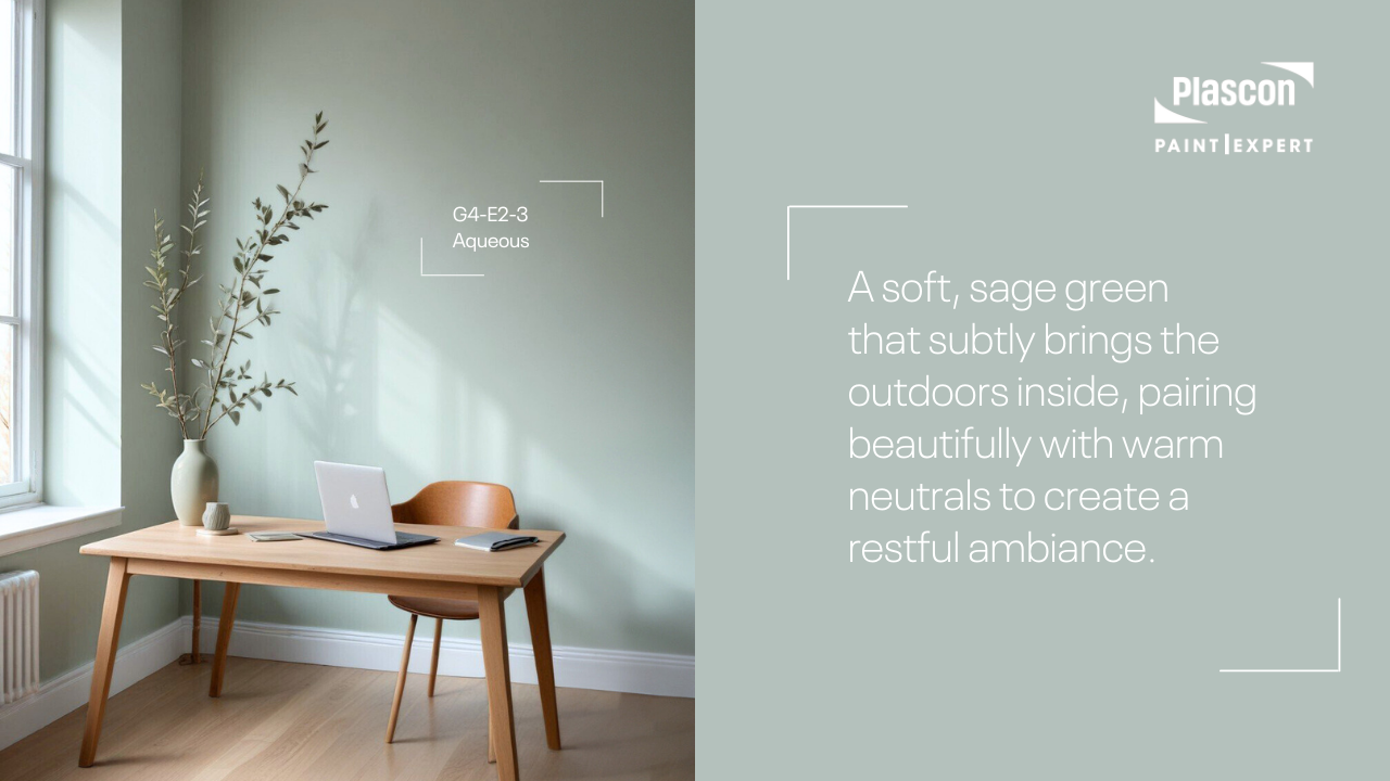
Bringing Nature Home
The Drift of Mist Colour Palette by Plascon Paint Expert is more than just a selection of paints. It’s a carefully curated collection that brings the soothing essence of nature into your home. Here’s how these colours can transform your space: Living Room- Maison Blanche and Aqueous: Use Maison Blanche as a base for walls with Aqueous for trim. This combination promotes a serene, open atmosphere, making your living room a perfect sanctuary for relaxation.
- Frozen Limeade and Fynbos Leaf: Liven up your kitchen with cabinets in Frozen Limeade and an accent wall in Fynbos Leaf. This lively combination will bring nature into the space, making it welcoming and vibrant.
- Bottlenose Dolphin and French Chartreuse: For a bedroom that feels like a retreat, paint the walls in French Chartreuse and accent with Bottlenose Dolphin. This pairing creates a tranquil, deep-sea calm, conducive to a good night’s sleep.
- Aqueous and Fynbos Leaf: Turn your bathroom into a spa-like space with walls in Aqueous complemented by accents in Fynbos Leaf. This blend mimics a refreshing, dewy morning, perfect for starting the day refreshed.
FAQs:
-
-
-
- What makes the Drift of Mist Colour Palette unique? Specially curated by Plascon Paint Expert, this palette is inspired by the natural beauty of misty South African mornings, this palette brings together a harmony of earthy and aquatic tones that transform your home into a peaceful haven.
- How can I best combine these colours in my home? Consider the natural light in your rooms and choose a base colour that complements this light. Use darker shades for accent walls or furniture to add depth and interest. Use the 60-30-10 Décor style to ensure you use these colours in balance. Read more about 60-30-10 here: Read more about 60-30-10 here:
- Where is the best place to buy Plascon products? The Plascon Paint Expert group of stores are Plascon’s chosen route to market partners, offering excellent service, knowledgeable paint advice, great quality Plascon products, and fantastic colour expertise.
-
-
Conclusion: Painting Your World
The Drift of Mist Colour Palette by Plascon Paint Expert is not just a trend; it’s a timeless collection that brings the outside in. By choosing these colours, you’re not just painting your walls—you’re crafting an environment. Whether it’s the neutral tone of Frozen Limeade or the serene depth of Bottlenose Dolphin, these colours offer a palette for everyone to find their peace and bring a slice of South African beauty into their home. For more colour inspiration follow our BLOG and our YouTube channel.
Related posts

DIY Box Wall Moulding on a South African Brick Wall: A Step-by-Step Guide

Quick Answer
Box wall moulding can be installed on a South African plastered brick wall using carefully measured timber mouldings an...
Budget-Friendly Paint Projects That Make a Big Difference in Your Home
Quick answer
A home refresh does not need to involve repainting every room. Focusing on one tired room, a hardworking high-traff...
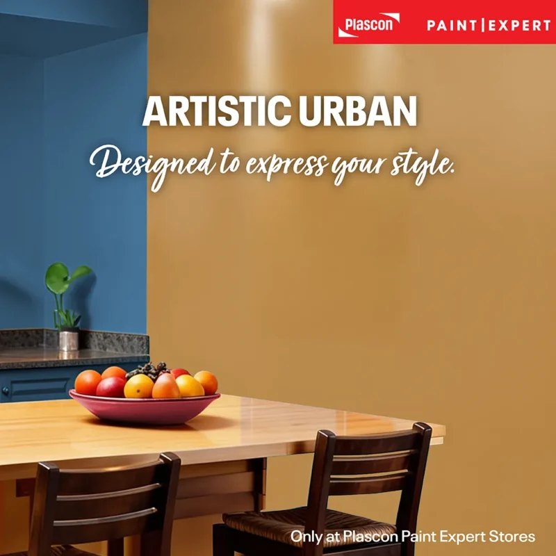
Artistic Urban: A Bold, Balanced Paint Colour Palette for Expressive South African Interiors
By Cheryl Lotter, Head of Marketing at Paint Club
Quick answer
The Paint Club Artistic Urban Colour Capsule combines Vincent (PEX...

The Ultimate Versatile Neutral: Joker by Paint Club
Joker by Paint Club is a muted, earthy tan-brown neutral with warm, ashy undertones. Its balanced blend of red, green and blu...

7 DIY Renovation Projects That Make Your Home Look More Expensive

Strategic DIY upgrades can dramatically improve the perceived value of a home without requiring a full renovation budget. The...

Plascon Etch Primer Gets a New Look – The Same Trusted Metal Primer Inside
Plascon’s long-standing etch primer is changing its packaging and product naming, but the formulation itself remains the same. Previous...

How to Paint Your Entire Home: A Practical DIY Guide for South African Homeowners
Painting your entire home successfully starts with choosing the right products for the right surfaces, preparing properly, an...

Bushveld Retreat: Bring the Calm of a Luxury Lodge Into Your Home
Bushveld Retreat is a Bespoke Colour Capsule by Paint Club, inspired by the soft, grounded palettes used in South African lux...

Moisture Testing & Damp Diagnosis: The Hidden Cause of Paint Failure

Few issues cause as much frustration in painting projects as paint that fails for “no obvious reason”.
Walls were cleaned.
The pain...

Deep, Grounded Green: Why Dark, Muted Greens Are Defining Modern Interiors
Deep, muted greens are becoming a dominant interior design trend because they create calm, grounded spaces that feel connecte...

Plaster Primers Explained: Why the Right Primer Determines the Life of Your Paint System
If paint systems could speak, most failures would tell the same story:
“The problem started before the paint ever went on.”
...

Taupe Tranquillity: Designing with Millionaire’s Mansion in South African Homes
There is a reason taupe keeps resurfacing in serious interior design conversations. It’s quiet without being bland. Warm with...
