By Cheryl Lotter, Head of Marketing at Paint Club
Quick answer
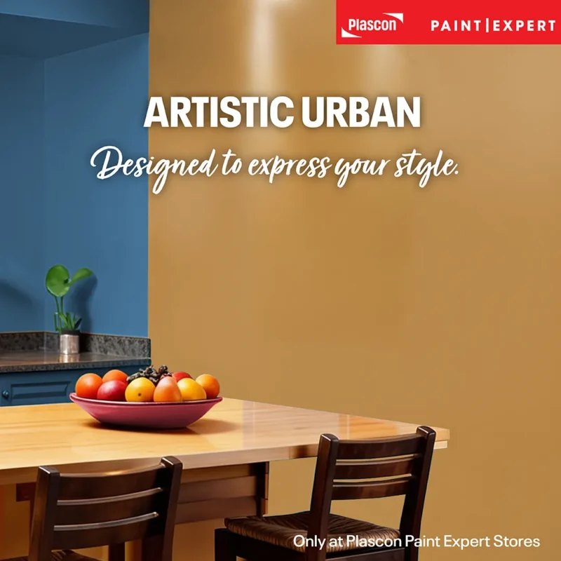
The Paint Club Artistic Urban Colour Capsule combines Vincent (PEX-B-005), a deep golden mustard; Irma Stern (PEX-B-006), a warm, muted coral-red; and Delft (PEX-B-008), a blue reminiscent of traditional Delft pottery. Used with considered proportions and a supporting neutral, these colours bring energy, warmth and individuality into an interior without making the room feel visually chaotic.
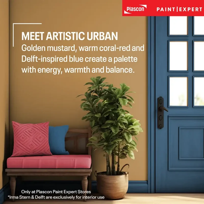
Designed to express your style
Some colour palettes are created to disappear quietly into the background. Artistic Urban takes a different approach. It gives a room a distinct identity while retaining the balance needed for comfortable, everyday living.
The capsule brings together three colours with very different personalities. Vincent is earthy and golden, Irma Stern is warm and expressive, and Delft introduces depth and structure. Each shade can hold its own, but the strength of the palette lies in the relationship between them.
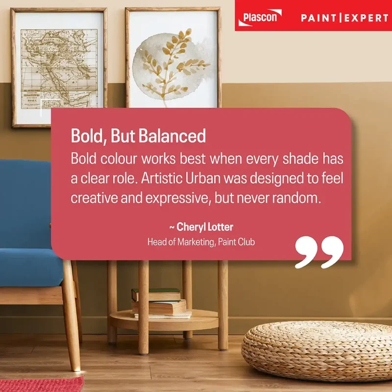
“Bold colour works best when every shade has a clear role. Artistic Urban was designed to feel creative and expressive, but never random.”
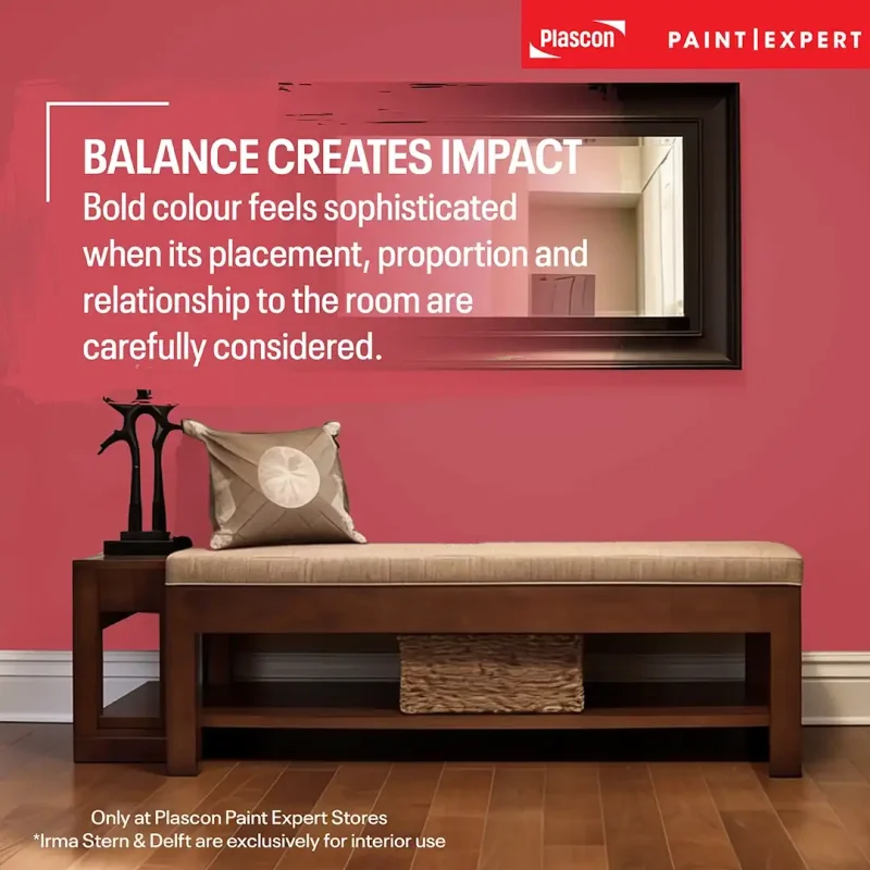
That distinction matters. A bold interior does not require three brightly painted walls, a collection of competing patterns and statement furniture in every corner. Often, one confident colour, repeated thoughtfully and balanced by calmer surfaces, creates a stronger result.
Artistic Urban is part of the Paint Club Bespoke Colour Collection, a curated range developed to help South Africans move beyond predictable colour choices and create spaces with greater personality.
What colours are included in the Artistic Urban Colour Capsule?
Artistic Urban consists of Vincent (PEX-B-005), Irma Stern (PEX-B-006) and Delft (PEX-B-008). Together, they form a warm, art-led palette with enough contrast to define a room and enough tonal depth to feel sophisticated.
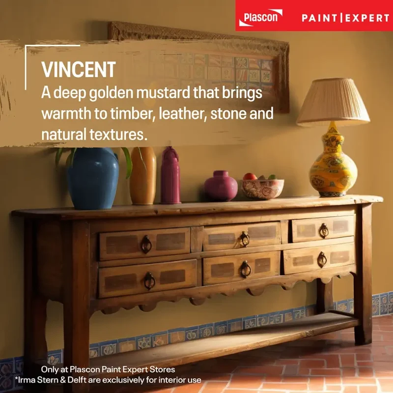
Vincent: a deep golden mustard
Vincent (PEX-B-005) is a deep mustard with a warm, golden character. It has greater earthiness than a clear, sunny yellow, making it easier to introduce into established interiors with timber, leather, stone and natural fibres.
Mustard works particularly well in rooms that need warmth. It can energise a living area, add intimacy to a dining room or turn a plain alcove into a deliberate architectural feature.
The colour’s name also invites an artistic association. Vincent van Gogh used yellow extensively during his time in Arles, applying different variations of the colour to express southern light and atmosphere. The Van Gogh Museum notes that his famous Sunflowers series demonstrated how numerous variations of yellow could create a complete image without losing impact. The museum also describes yellow as a colour closely connected with Van Gogh’s work and with ideas of warmth, radiance, courage and renewal. Van Gogh Museum: Sunflowers and Yellow: Beyond Van Gogh’s Colour.
In a contemporary home, Vincent is especially effective against chalky off-whites, warm greys and clay-based neutrals. Black accents sharpen it; medium and dark woods bring out its earthier side.
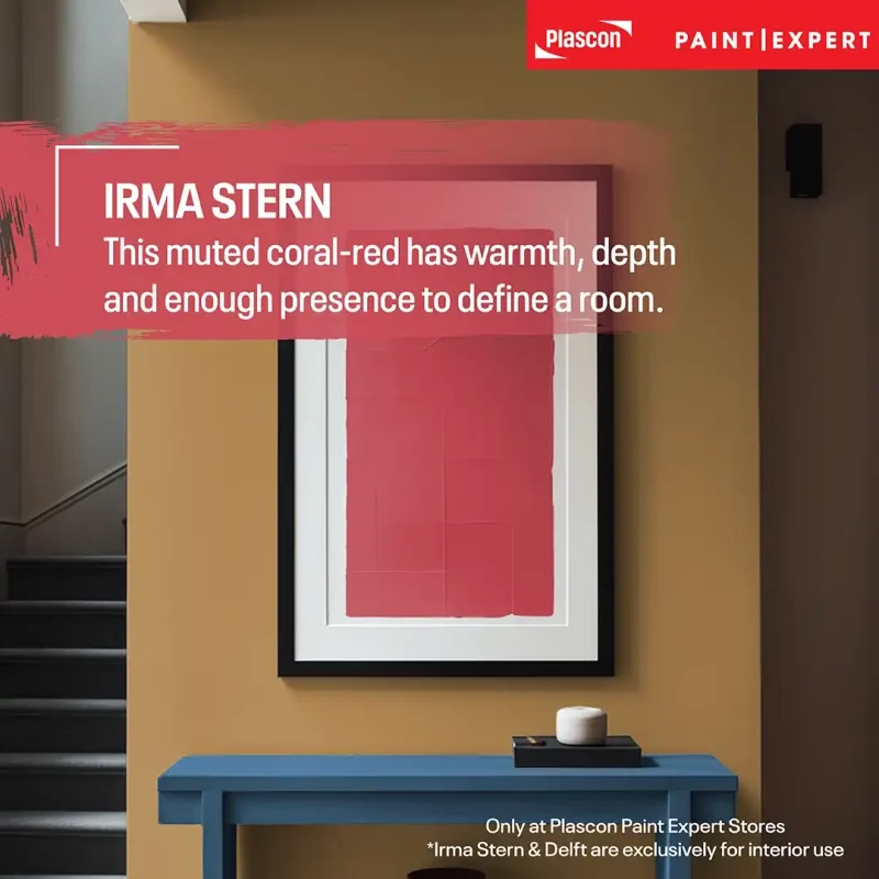
Irma Stern: a warm, expressive coral-red
Irma Stern (PEX-B-006) sits between dark red, coral red and dusky pink. It is vibrant but slightly muted, giving it warmth and presence without the sweetness often associated with a clearer pink.
This makes Irma Stern surprisingly adaptable. In strong natural light it can appear lively and sun-warmed. In a room with lower or warmer light, its deeper red undertones may become more apparent.
Irma Stern (1894–1966) is recognised by the University of Cape Town as one of South Africa’s foremost artists. Her legacy gives the colour a particularly meaningful local frame of reference, rooted in expressive South African art rather than a passing international trend. University of Cape Town: Irma Stern Museum.
I would use Irma Stern where a room needs warmth and emotional presence: behind a bed, in a dining space, on cabinetry, inside a reading nook or as the colour that connects artwork and textiles across a living room.
“Irma Stern is not a delicate pastel pink. It has substance. The coral and red undertones give it the confidence to sit alongside strong furniture, art and architectural detail.”
Delft: a blue with decorative depth
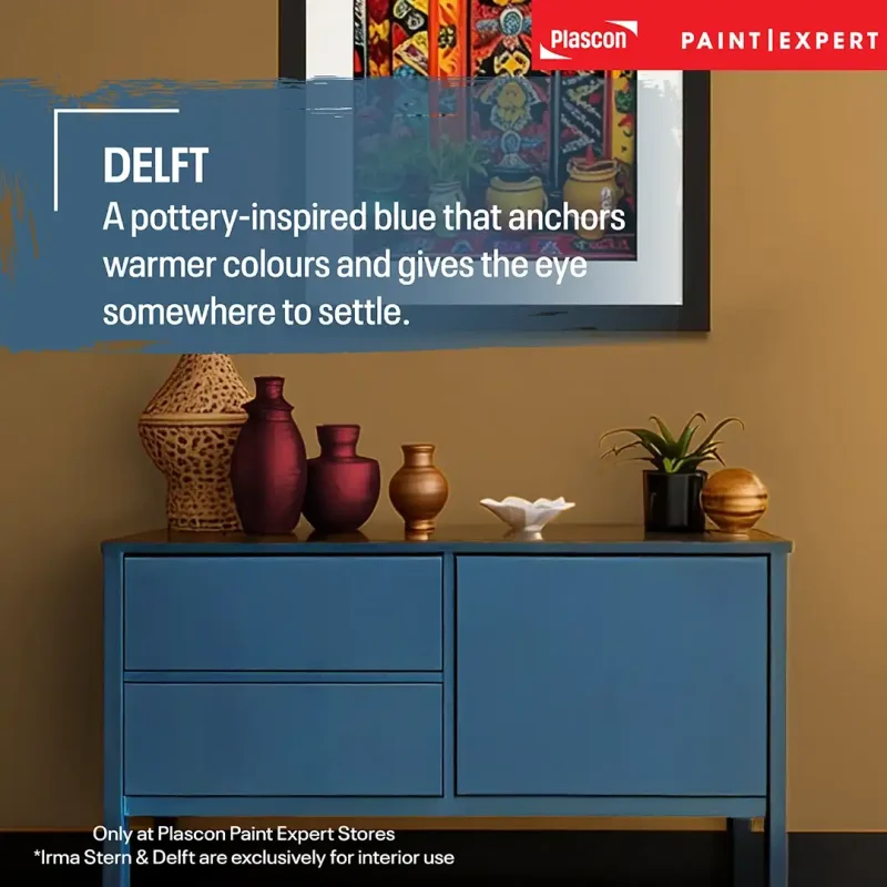
Delft (PEX-B-008) is evocative of the blue used in traditional Delft pottery. Within the Artistic Urban palette, it provides a cooler counterpoint to Vincent and Irma Stern.
Delftware has a long decorative history. The Rijksmuseum’s research collection includes approximately 1,600 pieces of Delft earthenware, with objects dating across the 17th, 18th and 19th centuries. This heritage helps explain why Delft blue feels at once decorative, familiar and enduring. Rijksmuseum Delftware research collection.
In an interior, Delft can function almost like a dark neutral. It has enough colour to establish a mood, yet it can also anchor patterned fabrics, timber furniture, metallic details and lighter walls. Used on joinery or a feature wall, it gives the eye somewhere to settle.
Delft is a natural choice for studies, bedrooms and living rooms, but it also lends itself to kitchens and bathrooms where blue-and-white decorative references already feel at home.
Why do these three colours work together?
Artistic Urban works because it balances warmth with coolness, brightness with depth, and expression with control. Vincent and Irma Stern bring warmth; Delft provides contrast and visual stability.
The palette also avoids the flatness that can occur when all the colours in a room have a similar temperature or intensity. Each shade makes the others more legible. Delft can make Vincent appear richer and more golden, while Vincent prevents Delft from feeling too cool. Irma Stern bridges the two with its combination of red warmth and muted depth.
Colour harmony has long been part of architecture and interior decoration. The Smithsonian Libraries’ historical colour collection documents how colour combinations were systematically developed for wallpaper, curtains, upholstery and architectural paint schemes as early as the 19th century. Smithsonian Libraries: Using Colour.
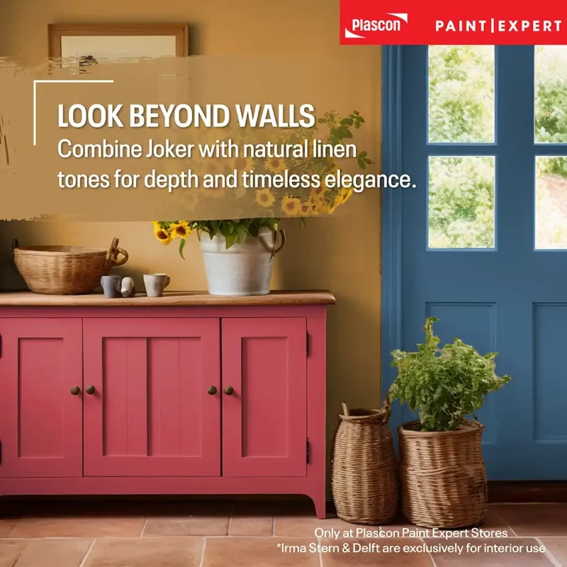
A harmonious room does not require closely matched colours. Contrast can be equally balanced when the shades are repeated in deliberate proportions.
How to use Artistic Urban without overwhelming a room
The safest way to use a bold palette is to decide which colour will lead, which will support it and which will appear as an accent. Avoid giving all three colours equal visual weight unless you are working with a highly controlled, pattern-led scheme.
A large room could use Delft on one wall, Vincent on an occasional chair or painted cabinet, and smaller touches of Irma Stern in artwork and textiles. In a lighter scheme, warm off-white walls could form the background while all three Artistic Urban colours appear through a combination of paint, furniture and accessories.
The familiar 60-30-10 decorating principle can provide a useful starting point:
- Approximately 60% is the room’s main colour, often a neutral across the walls and largest surfaces.
- Approximately 30% is a secondary colour used on furniture, curtains, joinery or a feature wall.
- Approximately 10% is an accent introduced through smaller painted areas, art and decorative pieces.
These proportions are guidance rather than a technical rule. Architecture, natural light, ceiling height, furniture scale and the purpose of the room should all influence the final balance.
Expert insight: Choose the lead colour according to the atmosphere you want. Vincent feels warm and sociable, Irma Stern feels expressive and enveloping, and Delft creates a more grounded, composed mood.
Three ways to build an Artistic Urban interior
- The gallery-inspired living room
Start with warm off-white or soft neutral walls. Use Delft on a built-in bookcase, fireplace surround or single focal wall, then bring in Vincent through an armchair, side table or painted pedestal.
Irma Stern can appear in framed art, a smaller piece of furniture or a restrained section of wall. Natural timber, woven fabrics and black picture frames will help the colours feel collected rather than themed.
Paint Club Bespoke Colour Collection
- The expressive bedroom
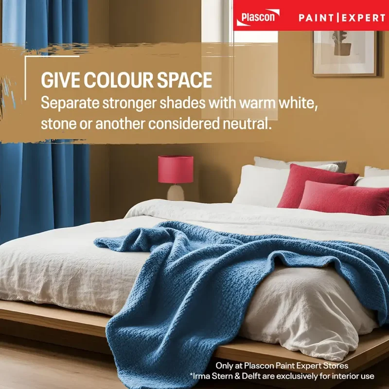
Irma Stern works well behind a bed because its muted warmth creates a sense of intimacy. Keep the remaining walls quieter, then introduce Delft through bedside tables, cushions or a painted door.
A small amount of Vincent can lift the scheme: a bench, lamp base, artwork or narrow painted border may be enough. Soft white bedding gives the eye a place to rest.
- The character-filled kitchen or dining area
Delft can give kitchen cabinetry or a dining-room wall strong definition. Vincent adds warmth through a painted dresser, shelving or selected dining chairs, while Irma Stern can be introduced through art or a smaller architectural feature.
In South African homes with open-plan kitchens and living areas, repeat each colour at least once across the connected space. Repetition creates continuity, but it does not need to be literal. A Delft wall in the kitchen might be echoed by blue patterning in the lounge rather than another large blue surface.
Want to see how the Artistic Urban palette could work in your own home? Use our Colour Visualiser to experiment with these shades in your space before you paint.
Light will change the way each colour appears
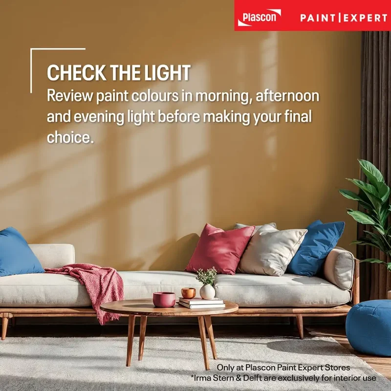
Paint colour should always be assessed in the room where it will be used. Directional daylight, surrounding surfaces and artificial lighting all affect how the eye perceives colour.
The International Commission on Illumination uses viewing-condition-specific models when studying colour appearance, reflecting the fact that perceived colour cannot be separated from its lighting environment. CIE: Colour Appearance Model.
In practical terms, Vincent may look brighter in strong daylight and browner in dimmer light. Irma Stern may reveal more coral in sunlight and more red under warm artificial lighting. Delft can look clearer and more decorative in bright light, then deeper and more enveloping after sunset.
This is particularly relevant in South Africa, where bright outdoor light can create strong contrast between sunlit and shaded parts of the same room. Review your colour at different times of day before committing to a large surface.
Practical tip: The Paint Club Colour Visualiser can help you compare the palette in a room image, but a digital preview should guide selection rather than replace an in-room colour assessment.
Matching Artistic Urban with materials and finishes
Artistic Urban works best with materials that have visible texture and character. Timber, cane, linen, leather, stone, ceramics and brushed metals prevent the palette from feeling too polished or artificial.
Vincent is especially compatible with walnut-toned or medium-brown timber. Irma Stern sits comfortably beside natural linen, warm metals and clay tones. Delft is strengthened by crisp white, pale stone, darker woods and black detailing.
Pattern should be chosen with some restraint. Stripes, checks, botanicals and painterly prints can all work, but allow one pattern to lead. Pull one or two capsule colours from it rather than trying to match every element in the room.
The three colours can be tinted into any tintable Plascon product, allowing the appropriate product and finish to be selected for the surface and room. Product choice should take the substrate, required durability, location and preparation needs into account. Ask an authorised Plascon Paint Expert store for product-specific advice before purchasing.
Practical tips for decorating with the Artistic Urban palette
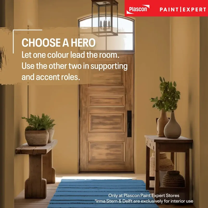
Tip 1: Choose one hero colour
Decide which shade will carry the room. Let the other two support it in smaller quantities.
Tip 2: Repeat colours with variation
A painted wall, patterned cushion and ceramic object do not need to be identical. Tonal variation makes a room feel layered.
Tip 3: Include visual breathing space
Use a warm white, stone, pale grey or another suitable neutral to separate stronger colour areas.
Tip 4: Test the relationship between colours
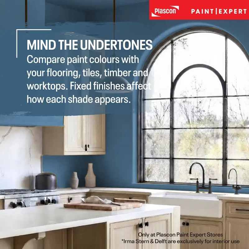
View your selected colours next to flooring, worktops, curtains and fixed cabinetry. Existing materials can alter how a colour reads.
Tip 5: Assess colour throughout the day
Look at the proposed palette in morning light, afternoon light and under the lamps used at night.
Tip 6: Match the paint product to the surface
Colour and product selection are separate decisions. Choose a tintable Plascon product suited to the substrate, location and performance required.
Common mistakes to avoid
Using all three colours in equal amounts
Equal proportions can make the room feel busy because every shade competes for attention. Select a lead colour, a supporting colour and an accent instead.
Choosing colour from a screen alone
Screens differ in brightness, calibration and colour reproduction. The digital representation of Vincent, Irma Stern or Delft may therefore vary from the applied paint.
Use the visualiser for exploration, then confirm your choice using physical colour references and in-room assessment.
Ignoring existing undertones
Flooring, tiles, stone and timber all influence a paint scheme. A fixed cool-grey floor, for example, will interact differently with Vincent and Irma Stern than warm terracotta tiles would.
Place the colours near the materials that will remain in the room before making a final decision.
Adding too many unrelated accent colours
Artistic Urban already contains three distinctive hues. Extra colours may weaken the relationship between them unless they are introduced through an intentional artwork or patterned textile.
Start with the capsule, a suitable neutral and the existing material palette. Add further colour only when it serves a clear purpose.
Treating bold colour as a feature wall formula
A feature wall can work, but it is not the only way to use colour. Doors, shelving, cabinetry, alcoves, ceilings and freestanding furniture may provide a more interesting application.
Key takeaways
- Artistic Urban combines Vincent (PEX-B-005), Irma Stern (PEX-B-006) and Delft (PEX-B-008).
- Vincent is a deep golden mustard, Irma Stern is a warm muted coral-red, and Delft is a blue evocative of Delft pottery.
- The palette is bold but balanced because it combines warm shades with a cooler anchoring blue.
- One colour should lead, while the remaining shades play supporting and accent roles.
- Warm whites, stone shades and other considered neutrals provide breathing space.
- Natural light, artificial light and surrounding materials affect the appearance of every paint colour.
- The Artistic Urban colours can be tinted into any tintable Plascon product.
- These Bespoke Colours are available exclusively from authorised Plascon Paint Expert stores nationwide.
Find and visualise the Artistic Urban colours
Explore the complete Paint Club Bespoke Colour Collection and use the Paint Club Colour Visualiser to preview Vincent, Irma Stern and Delft in different spaces.
Download the Artistic Urban broadsheet for a concise palette reference and decorating inspiration.
When you are ready to select your colours and the appropriate tintable Plascon product, find your nearest authorised store through the Plascon Paint Expert store locator.
“Artistic Urban gives people permission to use colour confidently. Its strength lies in thoughtful placement: enough colour to express who you are, with enough restraint to make the room feel resolved.” Cheryl Lötter – Paint Club Head of Marketing
Frequently asked questions
What colours are in the Artistic Urban Colour Capsule?
Artistic Urban includes Vincent (PEX-B-005), a deep golden mustard; Irma Stern (PEX-B-006), a warm, muted coral-red; and Delft (PEX-B-008), a blue evocative of Delft pottery.
Where can I buy the Artistic Urban colours?
The colours are available exclusively from authorised Plascon Paint Expert stores nationwide. Use the store locator to find a participating store.
Which Plascon products are available in these colours?
Vincent, Irma Stern and Delft can be tinted into any tintable Plascon product. Ask your authorised Plascon Paint Expert store to recommend the correct product for the surface, location and performance required.
Can I use all three Artistic Urban colours in one room?
Yes. The most balanced approach is to choose one dominant colour, use the second as support and reserve the third for smaller accents. A neutral background can create additional breathing space.
Which neutral colours work with Artistic Urban?
Warm whites, stone-inspired shades, soft greys and other muted neutrals are useful starting points. The best choice depends on the room’s flooring, fixed finishes, light and furnishings.
Is Vincent yellow or mustard?
Vincent (PEX-B-005) is best described as a deep golden mustard. Its earthy character gives it more depth than a clear or primary yellow.
Is Irma Stern pink or red?
Irma Stern (PEX-B-006) sits between dark red, coral red and dusky pink. It is a vibrant, warm and somewhat muted reddish-pink colour.
Is Delft suitable for a small room?
Yes. A deeper blue can give a small room character and definition, particularly when its placement is intentional. If painting every wall feels too strong, use Delft on cabinetry, a door, an alcove or one focal surface.
Can I use Artistic Urban in an open-plan home?
Yes. Repeat the palette selectively across connected areas to establish continuity. Each zone does not need all three colours; one shade can lead in one space and reappear as a smaller accent elsewhere.
Why does the paint colour look different at home?
The appearance of colour changes with daylight, artificial lighting, surrounding colours and surface orientation. Screens also reproduce colours differently, so digital imagery should not be treated as an exact colour standard.
How can I preview the Artistic Urban colours?
Use the Paint Club Colour Visualiser to explore the colours in room settings or in an image of your own space.
Disclaimer
Digital colour representations may differ from the appearance of applied paint because screens, lighting conditions, surrounding surfaces and substrate conditions affect colour perception. Use the Paint Club Colour Visualiser as a selection aid and confirm colour and product suitability with an authorised Plascon Paint Expert store. Follow the relevant Plascon product instructions for surface preparation, application, coverage, drying and safety.